Thursday, 21 May 2015

Post-Mortem

When I first started thinking about my FMP, I knew that what I really wanted to focus on was atmosphere. Very early on my main idea for this project had been to make some kind of rainforest treehouse-style base, but the more I thought about it, the more science-fiction aspects I wanted to include. One thing stayed constant though, I wanted foliage but I wanted it a little more colourful than what people are used to. Eventually it all formed into the idea of using the setting of an alien planet.


Project Details

Initial Brief-
“The subject of this project will be a small, three room futuristic house with a living area, bedroom, and bathroom (which will not be modelled) situated in a remote and possibly very alien forest. The interior should be populated to have a believably lived-in feel, as well as featuring some traditionally futuristic/spacey elements such as screens and holograms to sell the setting. The main assets outside the house will be a large radar dish and as a stretch goal, a landing pad, and a vista to be seen from the main window.”

As I was on my own for this project, I had to be very careful managing my workload. In my initial proposal I underestimated how long we had by a couple of weeks, but I decided to stick with that plan to allow myself as much extra time at the end as possible.
The project was to begin on the 12th January and end on the 24th April, giving us 12 weeks of term time. However the deadline was extended to allow everyone extra polishing time, adding an extra 4 weeks.

My technical goals were to have the level run at a bare minimum of 30FPS, aiming towards 60. Textures were to be roughly 512x512 per square meter, and that would also be the minimum size per sheet as I was informed that how Unreal stores assets there was little space saved by going any smaller.


Project Recap

Week 1- Concepting, whitebox, paintovers
Week 2- Refining whitebox, modelling main building
Week 3- Refining layout, modelling main building, texturing building
Week 4- Texturing building, satellite dish
Week 5- Grass, trees, outdoor steps, landing pad
Week 6- Bed, collision for building, working doors, seating
Week 7- Kitchenette, modelling cupboards, modelling/texturing base of orrery
Week 8- Orrery with holograms, freezer, foliage with lighting tweaks, high poly rocks
Week 9- Baked rocks & arranging, foliage, bridge, modelling patio & stepping stones
Week 10- Hanging chair, arranging foliage, table, small rocks, tree LODs
--Easter Break--  Water, skybox
Week 11- Clutter, orrery animation
Week 12- (working on another project), Lighting fixes
Week 13- Distant terrain, tree variations, terrain improvement, texturing patio, lighting fixes
Week 14- Improving existing assets, platform, forcefield, blinds
Week 15- Tweaking main building, minor assets, ivy and lights for patio, remaining collision
Week 16- Better wall texture, player respawning, landing pad details, lily pads, file management


What Worked Well?

I feel like the design I went with was pretty solid an interesting, and as the project progressed the architecture and layout of the scene became something that looks good from many different angles.
The integration of the house into the natural landscape adds to this, and the blues of the foliage balance out the warmer shades of the sky reflected in the metal of the structures. Even the colours of the interior are accentuated by the skybox as I limited my colour use to those blues, oranges and pinks.

The key assets and features I designed turned out to be quite successful focal points. Having the Orrery illuminated and moving really catches the eye, and with the way I arranged the furniture and the lit up platform it is very much the centre of the scene. The forcefield also adds some light and motion, and it brings the view out of the huge windows back to being more of a finale than if it were visible the whole time.

I think the space theme has been conveyed well with all of the theme-specific assets, but it is difficult to say at this point without the eyes of someone new to the project.


What Didn’t Work Well?

I believe the biggest problem with this project was a combination of the trees and the lighting. With the project lighting set to allow a darker atmosphere, shadows are baked much darker. This is especially visible on two sided materials, such as those used for foliage, and it is hard to brighten up these shadows by a lot without simply making the material self-illuminate. Add to that the style of tree I decided to make already being best viewed from above and you have some very flat looking branches.
I could’ve added more planes to the trees to make them look less like they were made of paper cut-outs but I had been warned of the risks of overdraw and was too worried that performance would be run into the ground with such dense areas of overlapping alpha channels.

The density of the foliage would’ve been less of a problem if the level were more compact. I probably could’ve gotten away with having much denser foliage if the playable area were smaller and I put more work into creating a better vista. I feel like I achieved my goals but not to a high standard.

Having to split my time up between working on the interior and the exterior would also have contributed to this. Sometimes it felt like I were working on two different environments- I found it hard to devote proper time to assets as I knew that if I focused on one area for too long the other would suffer. Maybe this would’ve been an advantage of working with a partner as both aspects of the level would’ve been able to receive simultaneous attention and development.


What Changes Happened?

The biggest changes to the plans occurred early on. I realized quite quickly that the landing pad was going to have to be more than a stretch goal as it added so much to the theme and to the layout of the level. The house design also changed a lot during the whitebox phase as I learnt what was and wasn’t practical. I ended up adding an extra aspect to the design with the hollow that the orrery now resides in, as said orrery made for a better focal point than a simple screen.

The only major late-game change was the water. This served two purposes- to fill a large area that would otherwise be filled with more boring foliage, and to add interest to the rocky cliff using the waterfall. I was quite apprehensive when making this change because I wasn’t sure how I would execute it but I am glad I did.


What Would I Do Differently?

 If I redid this project, I think I might try to do a smaller scene with the foliage arranged more tightly packed. I’d also make the house smaller- I made it the size it was to help with believability but it really stole my focus away from the surroundings. The ground foliage definitely received less work than I originally intended.
A smaller visible area would also have allowed me the extra performance to model my assets with greater complexity and detail, possibly even with higher texture sizes, to make the level look more next-gen. This would help with this project’s relevance in today’s industry with today’s technology.

Since I dabbled in animation for the Orrery, my next thought is that it would significantly improve my level if I could get the trees to move to simulate wind. I am unsure of what performance costs this would have but having a little more motion in the scene would really bring it to life. Additionally, a bit of rain would create an amazing atmosphere, although this probably wouldn’t work without significantly changing the skybox as a clear sky would make no sense.

As for the visual style, I’d definitely consider making some aspects of the house and landing pad look more alien. The patio area in particular. In addition I’d consider making the ever-problematic plants look more alien too, possibly considering bioluminescence.

Finally, I’d think of a better way of restricting the player. Right now there is too much freedom to wander around areas of the level that have had less focus. I do not want to be forced to implement invisible walls as that suggests bad level design.


Conclusion and Plans for the Future

I am fairly pleased with how this project turned out, and I think I learnt a lot. The feel of the level is very unique, taking a few more risks with performance would really make it something special.

I am glad that I had the opportunity to spend time on this project by myself, but I also wonder if having a partner or two working alongside me would’ve encouraged my own assets to improve more. Managing my time wasn’t a huge issue as I tackled the most important assets first. It is definitely something I have improved a lot on, though some assistance would be very helpful especially in terms of flexibility. For example I considered making a statue to sit in the front garden at the end of the project, but I was too worried that I might not finish such a complex asset in time. It would be more ideal if I could split the work between people to have simultaneous focus on extra assets and polish.

For the future I know I can afford to make assets more detailed, allowing things to be higher poly but of course still efficient. With so many rounded edges in my designs it’s really easy to see where I was trying to be careful. In addition I only really got the hang of working with vertex normals during this project, so I can use chamfering to greater effect.

As I have mentioned, I think it would be a great idea to focus a little more on animating assets to bring scenes to life. I was quite apprehensive when approaching the orrery but I am pleased with the result and I learnt a lot. It would be a waste to not touch the subject again and allow myself to forget such useful skills.

I think I also need to concentrate more on scale. I made the doors to be the exact same size as those in engine but they look a little too short so maybe I should’ve just gone with what I felt was the right height. It’s one of those things that’s very difficult to change later on in the project due to all the assets being the same scale, so I have to notice any issues with this kind of thing early on.


For my next project I am considering doing something stylized, because I have not done so before and so I don’t know if it’s something I’ll take a particular liking to or not. Texturing in particular is still something I feel I need to work on, and exploring different methods could yield interesting results.

Friday, 15 May 2015

Week 15

This was another week of small odd jobs.

I worked out how I had gotten past the “Degenerate Tangent Bases” issue on the main building shell the first time around, and was able to re-import it after fixing a couple of small issues such as unsmoothed surfaces.

It allowed to me to cut a hole for the large cupboard so it wouldn’t look like it were just pasted on. The cupboard itself didn’t take long to make as it was a very simple design, though I am undecided as to whether I should go back and add a handle.

I made some simple orange glowing lights to line the roof struts in the hopes that this would help sell the holographic shielding concept.

I spent a while sculpting a generic lump of fabric to fill some more space in the storage area. I put the normal normals on the same map as the seating cushions as there was an awful lot of free space. That made me feel a lot better about their efficiency.
I also made the books for the shelf. I only needed the outside covers to be modelled due to the angle they would be viewed from. In the UV space, I reduced the size of the front and back covers of all the books other than the ones at the ends of the piles, as any detail given to them would be hidden anyway. I decorated the spines with the alien lettering I had made up for the orrery.


I made some wardrobes to add realism to the bedroom. This was another simple asset I could texture with a tileable. Unfortunately I realised it didn’t make sense to have them line up with the back wall as then the bedside tables would get in the way of the doors opening, so I had to move them out a bit. I am not really happy with having to do this as I don’t think it looks as good. I may decide to change them.

The front of the house still needed a fair bit of work as there was no visible source of light and none of the plants I had made fit well between the house and the patio. I had to create a simple long tube light, as I couldn’t fit more than one light source in that area. In place of the plants I decided to create some ivy. I used a photo I had to get the leaves as I didn’t have any ideas when it came to making them look more alien. I arranged different planes of these leaves in a way that they would look like they were climbing up the wall, to add some interest to the blank surface.


Some other small tweaks I made near the end of the week included adding some metal trim to distinguish between the paneling below the balcony and the front panel, and changing the height of the Orrery to fit in where the newly added platform had reduced vertical space.

Finally, I got around to fixing collision so that the player wouldn’t be able to run through the trees out into nothingness. I added collision prisms to all of the rocks and trees, but anything placed with the foliage actor couldn’t use its collision. For this I had to manually add blocking volumes, so I ended up with a less accurate result but a more secure one. There are definitely no gaps the player could sneak through.
As an extra touch I used blueprints to make sure the player would automatically restart at the spawn point if they were to jump into the water. This also happens if the player presses enter, just in case they somehow get stuck. I wanted to try and have the whole level restart, so the shield matinee would reset on respawn, but I couldn’t work out how to do this as the events were on different blueprints and UE4 doesn’t support global variables.


By the end of the week I had a functioning level with no major lighting errors. There is still some polishing to be done, but all the major outlying tasks have been covered. I think the biggest issue I am seeing right now is the lack of detail on the walls, so I need to add some texture to them.

Wednesday, 13 May 2015

Week 14


This week was shorter than usual due to a bank holiday on the Monday. Since there were three weeks left to the project the priority was to ensure I had everything that was already in engine at a passable standard, just so I wouldn’t have to worry at the end.

The cupboards had had fairly little work put into them, and the ladder- one of the main features of the asset- hadn’t been made at all. I fixed this quite quickly, deciding that any additions from this point onward could probably be unwrapped to a separate texture sheet, so I got the lightmap made and out of the way.

I then returned to the matter of the platform. Due to some strange errors I has having I couldn’t have light shining out of the edges of it and reflecting on the floor, as the floor was not showing any lights I added. The change I made to make up for this was to have the lights below the edge shining upwards, with a border added around this to disguise where the light would hit the floor. This worked surprisingly well.


I put a window frame in the skylight to add some detail to the hallway, as well as making some lights to brighten and add interest. I made them ring shaped to go with the lights around the platform.

It was difficult now having so many lights in the scene, as Unreal doesn’t let you have more than four baked lights interfering with each other. Fortunately there were only a couple of errors, and I could see the overlapping attenuation radii by setting the viewport to display lighting complexity. The only really visible change I had to make was removing one of the lights from the patio, but having both lighting and foliage coming from the ground up against the wall was unlikely to look the way I intended anyway.

Another outlying job was to add cables to the lamp and weather station, and make something for the orrery’s cables to go into. This was quite simple, and the generator I made didn’t need too much texturing work to look convincing due to being so small.

My favourite achievement of the week was making a force field above the living room. I had to create a material that contained a variable, then a matinee that controlled that variable within a small time frame. When the matinee would play had to be controlled in the level blueprint, so I decided to use a trigger box. This part was quite easy as I had experimented with object-oriented programming before.


I had originally started making the material by modifying a duplicate of the basic glass material included with the editor as I was going to have the glass and forcefield all in one, but I was having some trouble with re-importing the building shell at the time. In the end I made the shield as a separate mesh and deleted all the refraction inputs that had made it glass like as they weren’t necessary. The pattern that appears as the shield disappears I made by combining a basic gradient texture and another texture of a simple hexagon mesh. I gave this mesh a blurred edge so that the mask would change as the variable changed. Adding the glowing edges as the mask transitioned was simple as it involved duplicating the existing mask and changing the value at which it was opaque just slightly to offset it.  To get the animation looking its best, I was sure to have the UVs of the forcefield mesh mirrored down the centre, and that this seam would line up perfectly with the hexagon pattern.

As a final quick task for the week I made blinds for the bedroom, to add a little more detail and realism.


Friday, 1 May 2015

Week 12/13

From what I understood, my diorama project from Christmas was due to be resubmitted at the end of what would’ve been week 12, so I spent almost all week polishing that. However, at the end of the week we did presentations to the tutors and small groups of our peers so as to receive feedback.
The main issue was my lighting inside the house. I desperately needed more light to highlight the assets I had made as the light from the skybox wasn’t enough. One of my peers gave me some good advice and even fixed a problem that I was having with the Orrery casting strange shadows.

Week 13 I mostly decided to dedicate to improving the foliage variation, as I had been given feedback on that previously. The first day I spent creating a piece of terrain that you would see in the distance. I started by creating a simple mesh, then I decided I wanted more detail so I brought it into Zbrush to create more mountainous-looking normal map for it. Unfortunately this wasn’t really visible, so I decided to use the normal map to make some ambient occlusion instead. Combined with the textures I used for the rest of the terrain and some LOD trees, the result was passable but not great.


I decided to make a variation of tree that would feature less than the main ones, adding a little texture and colour difference to the scene. They would be around the same height but very slightly greener than their more common counterparts. The leaves I created using photographs of trees against very white skies so I could edit them easily. I put a vertex in the middle of each clump and pulled at them slightly with soft selection so they wouldn’t be perfectly flat. Arranging the leaves took the longest time. When I was done I edited the vertex normals in Maya and when I was finished I was pleased with the result. The texture map I used had some left over space, and I made a rough flower to experiment with.
I made another tree too, this time shorter and a more purple colour, using the same techniques. However the clumps of tree branch I used this time were too big and resulted in the planes being too easily distinguishable from each other. I am considering going back and adding more planes. The only other option is to remake the leaves entirely.


I finally got around to baking down a better rock texture to fade out my cliff, arranging the high poly rocks over a plane in Max. I also made a darker grass terrain to blend in shadowed areas alongside making a more illuminated version of my grass plane texture to place in areas without shadow.

I roughly textured the patio as it had been left blank…


And finally, at the end of the week, I managed to fix the lightmap on my building! At some point the instance of the mesh had been set to override the lightmap resolution to be smaller.

Friday, 17 April 2015

Easter Recap and Week 11

Work-wise, my priority over Easter was split between this and improving the diorama project. With that in mind I did not progress an awful lot but the changes I did make were important ones.

I created the lake using a combination of a couple of different tutorials and a lot of additional tweaking. One of the tutorials was quite complex and possibly more than is needed for my lighting conditions so I may go back and remove some sections. The waterfall itself required less tweaking but the addition of more textures layered over the top to add movement. I actually sculpted and baked the waterfall but it isn’t very visible. To mask the seam between the waterfall and lake, and add some realism, I created a few particle systems for foam and splashes. Changes I’m considering making include adding more foam to the waterfall, and continuing to turn down the metalness.


The other change was that I finally created the skybox. This involved a program called SpaceScape where you create layers and play around with variables to create nebulas. I tried to use it without a tutorial but wasn’t at all happy with the result so I tried again with one, and then made changes and duplicated layers to turn it into what I wanted. I then had to use the Nvidia texture tools to stitch the six renders together to make the cubemap compatible with UE4. This is where I hit a snag, as the way the sky sphere worked meant the texture couldn’t be rotated. All I could do was keep returning to Photoshop, roatating and switching around the six sides and re-saving, hoping I had done everything correctly. The current view of the skybox in game was the best position I could do.


Week 11

The first day back I spent modelling small assets and trying to fix the lightmap issues I was having. I managed to improve the problem, but not make it go away.

The next day I decided to tackle something different for a change, animating the Orrery. I used bones for each planet’s orbit, their holographic rotation and their holographic annotations. It didn’t take an awful lot of playing around to work out how to get the bones linked up the way I wanted, but once I was done making it animate correctly was tricky. I’d set the main bones up so that their axis matched up with the orbits would follow, but the animation seemed to scoop, moving more horizontally before realigning upwards or downwards towards the keyframe location. This meant if I only used the start and end keyframes they rotated only on the horizontal instead of around their orbits. It turned out I needed to tell the keyframes what axis to prioritise to fix this. The holographic signs I had to set to not have their rotation affected by the bones they were linked to so that they would always face forward.
The real problem arose when the animation I imported didn’t match what was in Max. My first import had the planets and their labels rotating in place on a strange axis. This I fixed by selecting the ‘Resample All’ checkbox. Then all bones were having an effect, but the planets were yet again only rotating horizontally. Eventually I worked out that I had to go back to Max and lock all the variables that weren’t being animated. I don’t understand why exactly this worked but now I know for the future.


For the rest of the week I continued working on the small assets to add character to the interior. The aim was to fit them all onto the one sheet with the weather station. I’d had ideas already about what small assets to make but once I had used up all the most suitable ideas I was still left with some gaps on the UV map, so I spent extra time thinking of even more generic assets such as coasters.

Friday, 20 March 2015

Week 10

This week’s work mostly consisted of tweaking existing assets and making small changes. The first couple of days involved sculpting and baking the hanging chair, which was pretty much problem-free apart from the backing to the seat cushions. Since the cushioning was made from a rough base I had to form the smooth back around it. Eventually I made something passable using Boolean functions.


I finished arranging the remaining leaf clumps into basic shapes so I could use them in the level. I returned to the others and made sure all had proper lightmaps and then added them to the foliage brush tool. The framerate wasn’t affected too much by bordering the upper area of the level, however the lighting isn’t fantastic. It isn’t as major since they aren’t supposed to blend into the ground like the grass is, but I might make them slightly emissive to match the trees better.

I also tweaked the bridge to an acceptable level and for texturing and for the lightmap. I gave the landing pad a lightmap, adjusted the chairs, made the table, and sculpted some smaller rocks.

I finally made the LODs for the main trees. I had to try and vaguely match the lighting in max then adjust the colours in photoshop to match the existing trees. I set them to be emissive and unlit so the colours wouldn’t be affected. I still need to cut down the planes they are on as there is a lot of alpha’d blank space that could potentially cause overdraw. I also changed one of the settings on the larger rocks and now they look miles better, though I can't say I'm done with them yet. I need to bake a better rock tilable for the terrain.


Current issues I am having:

-Spotlights are not baking down, their effects disappear upon bake
-Many lightmaps have suddenly become strangely pixelated and full of errors
-Grass planes don’t blend into grass terrain. Improved by keeping planes one-sided but not perfect.


At the end of the week it was revealed that we have an extra four weeks on this project. This makes having to work over Easter less of a worry as my home productivity is slightly less of an issue. I does mean I have the time to execute the more ambitious ideas I’d had for the project, such as a water feature. The shape of the cliff would work great with a waterfall, going under the landing pad bridge and into a possible lake filling the lower area. This would help fill the area a lot. I might need to try and work with shaders however to try and make the water’s edge convincing, which could be difficult. 

Friday, 13 March 2015

Week 9

Once I had baked down the rocks from the previous week, I duplicated and exported halves of the larger rocks from different angles, as they would only be half visible with how I was going to position them and it saved on geometry. With all of them exported I set out to make the cliff face. The effect of them overlapping wasn’t perfect but it was passable. However, where the edges met grass it looked incredibly unnatural. First I tried out vertex painting, which was an improvement, especially at the top where the terrain became flat again. I knew I had to do more though, so I created another terrain texture based on the rocks to help things blend. This texture honestly looks pretty bad on large areas, but when put to its intended use of filling gaps and blending seams it’s quite successful.

I quickly made an overhanging piece of cliff that I then used vertex paint to blend into the terrain. This made a very slight improvement though they do look bad up close. I positioned clumps of grass on the edge to improve it slightly. I had to add random tufts between bits of rock too to add variance. It was clear the next step would be to create more foliage.

I spent a long time making heightmaps for a variety of leaf clumps on one texture sheet. After arranging a couple of plants I imported them into UE4 and they immediately made a lot of difference. I made quick but effective path lights for the staircase and with them and the plants it went from being one of my least favourite areas to something I liked. Arranging leaves on plants wasn’t the most mentally stimulating activity however so I decided to leave them for a while. None of these foliage assets have proper lightmaps yet, nor do the rocks and most other recently created assets, so they don’t look perfect in the screenshot below, of course I shall return to all this later.


I made the mesh and collision for the bridge. I do not consider it completely finished as the way it connects to the landing pad doesn’t yet look right. I used the same tileable texture as the metal parts of the main building to keep things consistent, as well as using the same mesh as the landing pad. I also made a base mesh for the patio out the front of the house. The stepping stones I actually sculpted to make them more convincing. This is looking to have been a waste of time, as in engine they don’t look that great. I’m not sure whether this is due to the vertex normals being wrong or not imported, as well as the noise I applied to them after sculpting not being baked down.

I worked out how to change the colours in the default blueprint for the skybox, but I found that making the glow around the horizon a stronger colour like in my original concepts caused the colours to clash. In the end I toned it down again, making it only marginally brighter than the default. I have yet to make the actual texture I want to use for the stars- I’m most likely going to end up having to use a free program called SpaceScape to generate my galaxy. Of course I can’t download this to the lab computers so I will probably do so over Easter when I am forced to work on my own machine.

The main priority at the moment is to create foliage and other assets that can be used to block off the areas the player shouldn’t be able to access, but I feel a little burnt out with the foliage right now so I have started work on the hanging chair in the corner of the lounge- the last of the larger interior assets. I have been worrying about overdraw the most so far but from what I have observed the any notable issues I see are caused by not baking the lightmaps. It might be interesting to go around deleting groups of assets with alpha channels to test out if there are improvements I should make.


Monday, 9 March 2015

Week 8

I finished the Orrery’s data holograms, and added an asteroid belt made of low poly shapes to flesh things out a little more.

The plan was to move on to the freezer next. I modelled it very basically and imported it in to my level to preview how it was going, and found that it actually didn’t look too bad as it was with just basic materials. The parts that would need proper modelling/texturing would be the workings at the back, and that would be in shadow anyway. I do still intend to return to this asset, but fleshing it out is very low down on my list of priorities.

I decided it was time to set aside the interior and put more focus on the exterior. I started with some small tweaks, like adding a small amount of illumination to the trees to slightly cancel out the strange shadows near their tops. I also arranged the grass planes I had made previously into actual clumps.
Because I had only used two branch variations for the trees, their UV map had a fair amount of empty space. I decided to use this space for another piece of foliage. Starting with the basic shapes, I began a heightmap for two clusters of leaves. I had used this method to create leaves before and found it to be effective, but it took a lot longer this time around as some of the leaves were overlapping on this map. I made the albedo after this- I was not quite satisfied with it but with how long the normal map generation took I wanted to spend time on other assets.


The slope below the building was looking very bare- I originally wanted to cover it in foliage but the potential for overdraw was too high. The other option was to make the surface rocky. I quickly made three simple shapes in Max, imported them to Zbrush and began working. I think something I need to remember in future is to break up the shapes more, because flattening off edges on large rounded areas isn’t as effective as doing the same on smaller ones. Using brushes like Orb Cracks and the noise feature I got a passable shape, and then I did some polypaint. Of course I had forgotten that I couldn’t bake polypaint in Max, but after some hasty research I found I could use Xnormal. I still had to create the lower poly version however, so I had a play around with zRemesher. I got a half decent result, exported and unwrapped it, and ran everything through Xnormal to generate the maps. Unsurprisingly the result wasn’t fantastic, the topology zBrush had generated was far too rounded, and I had subsequently done a very rough unwrap. I had to do it manually.


The retopology took an entire day due to the size of the assets but it allowed me to create much better seams and gave the rocks more defined silhouettes. I received some feedback on the level so far while I was working on them and one suggestion was to create a bit of an overhang with grass to sell the cliff face idea. This is something I will most likely make next week along with more foliage.

Monday, 2 March 2015

Week 7

This week I continued to work on major interior assets. The first task was to model the kitchenette, which wasn’t the most exciting job but a fairly important one. I had decided that for most of the asset I’d use tileable textures, and have one texture sheet for details such as the plugholes and oven grilles. This all worked pretty well- I still need to make a tileable for the work surface but as it stands it is acceptable.


The next asset I decided to touch upon was the cupboards over the bedroom door. I say touched upon as it wasn’t long before I decided other assets were more important. I had a surprising amount of trouble deciding on what material I’d use. The materials I’d used for the white cupboards in the kitchen and the black bedside cabinets were both too bold for the location, they couldn’t match the walls perfectly and I thought it would be weird for them to perfectly match the flooring, although this did look the best by far. Eventually I created a new wood texture, this time stained/painted grey. I like the result, so I’ll probably use it on other assets too.
I started making some clutter to put with the cupboards in the form of a rucksack and sleeping bag, which were quick to sculpt. The texture I used was fairly small, but this is efficient as they are seen from a good enough distance. In the picture below you can see the state I left the asset. You can also see an Issue I am having with the light from the bedroom shining through the ceiling. This might be a problem with setting one of those lights to not cast shadows. Lighting is still something I need to heavily tweak.


I quickly moved on to the orrery, possibly the most important asset of the main room. I had my work cut out to make it believably functional while still having the look I wanted. A real-life orrery tends to have the planets held up by struts from underneath, so they do not intersect each other. However, I thought this looked too old-fashioned for what I envisioned, despite still wanting the main structure to be physical. I decided the best way to get the look I wanted was to have the orbits of each planet be technically rails, with the planets moving along them independently. Unfortunately I forgot that the other purpose of having the planets suspended from below was so that they could rotate on that axis. I already wanted to put holographic signs by each planet, so the compromise I came to was to encapsulate each planet with a holographic shell that would itself rotate, showing their correct axes.


I still need to work on the holographic signs of this asset. I think it might also look good to have a curved screen behind it, so once I’ve finished the main element I may move on to that. Looking at the scene currently I think there is too big a contrast between the technology of the orrery and that of the kitchen, but I’m now considering adding holographic controls to the oven and microwave. The other issue is that the kitchen looks odd on its own, so it is important I get the freezer made quickly.

Friday, 20 February 2015

Weeks Five and Six


--Week Five--


I began the week working on some foliage, baking down the grass I had made at the end of the previous week and modelling the branches for the trees. I baked down the tree branches too and arranged them the best I could in a tree shape, using planes cropped tight to the edges to try and prevent issues with overdraw. I’m not 100% satisfied with how these models look, as they are viewed from quite low down and therefore the planes are very visible. I decided to try and improve their look by editing the vertex normals.

I did this using Maya, by transferring the normals of another shape. This took a while since I hadn’t tried it before and there issues I hadn’t expected, but eventually I got it to work. The picture below shows the tree before and after I tried this technique- I think the effect is interesting but not much better as it is. I would like for the tree tops to appear darker since they are where the sharply shadowed planes are most noticeable. I almost certainly will revisit them.


The next asset I did some work on was the steps outside. I created a base mesh in Max which was composed of two pieces of stairway, and imported it to Zbrush. I sculpted it so it would resemble pieces of flagstone, which took a fair amount of time. I then used Zremesher to create a lower poly version. I wasn’t too happy with the efficiency of this however, so before I attempted any baking I cut out the main steps and replaced them with chamfered versions of the base mesh. This worked well since the steps themselves were fairly regular shaped, it was just the walls around them that needed more polys. However I’m not completely satisfied with the outcome, as when I imported the mesh into UE4 the normals didn’t look as convincing as I had hoped. This may be an issue I have to fix with the albedo. I would probably be needing to revisit them anyway due to how I plan for them to intersect with the ground.


At the end of the week I started making the landing pad, but I worried about the amount of time it was taking, and by the end of the day I decided I wanted to focus more on assets for the building’s interior. I had been working on the bed’s headboard to fill time here and there so that was the obvious starting point.


--Week Six--


I did toy with using a cloth modifier to create the bed’s duvet, but that wasn’t going to give the puffy look I wanted so my only option was to sculpt it from a base mesh made in Max. This turned out to be fairly simple, and I managed to make the fabric quite convincing. I textured it with dark colours decorated with a printed lace pattern that I drew by hand, using yellow to match the feature lighting in the headboard. The bedframe, headboard and bedside cabinets were combined together as one asset. With the lighting unbaked the asset looks quite appealing, with the yellow lighting from the headboard and subtle blue lighting from outside. However, when the lighting is baked the asset becomes quite difficult to see due to the dark colour, and the light from outside is no longer visible. This may be because I have tweaked the world settings and global post-process too much when trying to darken the exterior of the building, so I will need to revisit this later. Another issue I’m having is positioning the light in the bedroom so it appears to come from the headboard. Right now I am more concerned with ensuring I produce all the assets I need so this shall also be postponed.


It was at this stage I realised I had completely forgotten about collision on the assets I had made so far. I added checkboxes for both collision and lightmaps on my asset list so I wouldn’t end up forgetting about it until last minute. I then created collision for the main building. The whole structure is still one large asset, so the collision ended up being formed of over 40 boxes. This doesn’t seem to be a problem.

I then modelled three different kinds of door for the level- a front door, a balcony door and one for going between rooms (though I now realise I haven’t made wardrobe doors yet). Due to the house’s modern theming I was able to create them in a way that they only needed tileable textures. I used a tutorial to make blueprints for them. I had never worked with blueprints before in UE4 so I had problems with some pretty basic things, such as changing the base mesh and materials, but I worked things out eventually. An interesting extra stretch goal might be to make the door handles move when you use them, but any animation I try and utilise will be used on more important assets such as the orrery.


My final task of the week was making the seating. Due to their simple design I could use the cushions I made for the whitebox, so I modelled the frame off them and imported them into Zbrush. I just needed to sculpt the seams on and some subtle creases for realism so it didn’t take long. However, when I tried to bake them down in max I found that there was a lot of strongly visible noise. After playing around with the settings a bit I managed to decrease it, then I baked it out twice the size I was going to need so I could resize it down and decrease the noise further. The albedo I was originally create as a map but with the cushions each being one solid colour I decided it would be more efficient to make a tileable I could change colour and apply to each.  

Next week I will continue to create the main assets for the interior. I feel I should make some of the kitchen assets next to fill the room a little more.

Monday, 9 February 2015

Week 4 Summary

This week was a somewhat slow one, not least because of finally catching the cold that was going around.

After continuing to make tileable textures for the main building for a while, I started work on the satellite dish. The modelling didn’t take too long due to the simple shapes and the ability to use modifiers such as lattice to make the scaffold around the dish. However it did take a very long time to unwrap since I then had to unwrap each strut individually. There are currently a couple of small gaps in the UV map so it isn’t as efficient as it could be, but it is very likely I will add another smaller dish to the side of the structure that can then make use of that area.

Texturing the dish was difficult- the whole asset would almost entirely be made of the same material so I’d need to make it convincing. I spent a long time adding highlights and some subtle weathering but I’m still not happy with the result. Ideally I would be able to use a texturing program like those often used in the industry such as Substance Painter or Quixel Suite, but as I greatly prefer working in the labs I am presented with the problem of not being able to install programs on university machines. Substance Painter does bypass this by being accessible by steam, but it is a lot more expensive than Quixel, and does a lot less. I am going to try and speak to the lecturers to see if there is anything I can do.


At the end of the week I started making grass to bake down onto planes. We decided to do presentations among ourselves to see people’s progress and offer each other advice. I don’t think I conveyed the alien forest idea perfectly since a lot of suggestions were things like adding lots of moon dust, I could still use the idea of a crater or two to add interesting features. Other ideas included having glass that changes opacity rather than shutters, and shooting stars. They thought the texture on my satellite dish was good but needed work on the specular.


The tasks for next week will be to make foliage and revisit the main building to create a lightmap.

Friday, 30 January 2015

Week 3- Getting Stuck In

The week started with further feedback- I was given the idea of creating a cut-out area of wall where the screen was and relocating the mobile there from the corner of the room. The problem was that this would take a chunk out of one of the supporting struts. I decided to allow this for now with the hopes that with the other struts on either side it wouldn’t be a noticeable problem but I may return to it later if surrounding furnishings don’t help.

I decided the newly vacated space in the corner would be perfect for one of those futuristic hanging chairs, however since there is a window above it there is nothing to hang it from I will need to find a way of suspending it from the beams either side. The shapes I have used in the whitebox for it also aren’t necessarily what it will look like modelled- I am very conscious of the potential for it to end up looking retro instead of futuristic like intended.


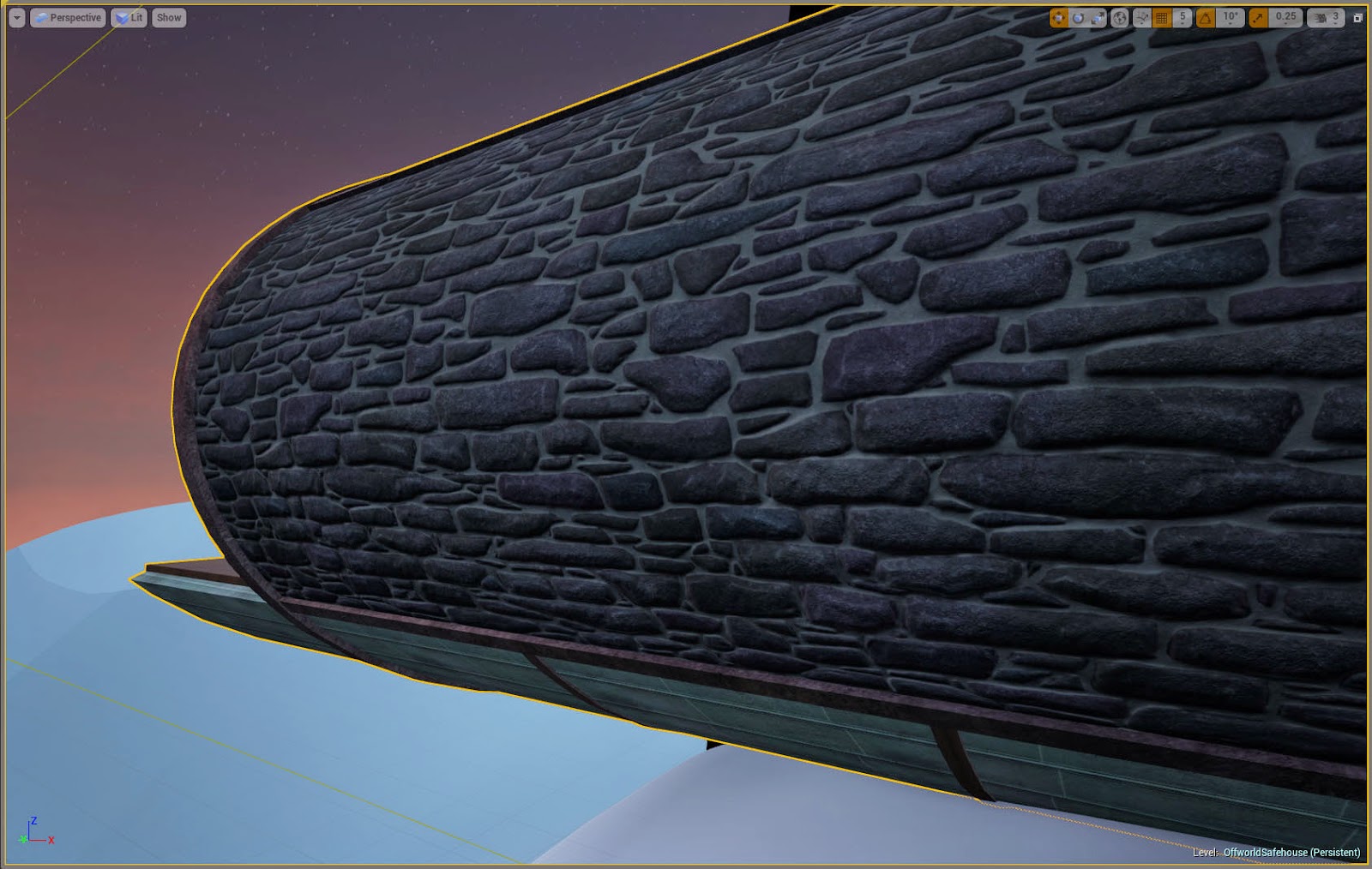
Once all this rearranging was done I decided I was very happy with how things were looking so far and pushed ahead with the architectural modelling. I also started making the tileable textures to use on it. I had a clear vision of the kind of bricks I would use for the outside of the tube, but I didn’t have anything close from the photos I had taken in the past so I had to draw the bricks in from scratch. This also turned into an opportunity to experiment with creating tileable normal maps in Zbrush, something I had never done before. Currently I’d say it’s not entirely what I envisioned but I’m still quite proud, so I’m satisfied for now but I may revisit it later. I do still need to create a roughness map for it however.


So far maintaining texture density has been quite a concern. My main issue with the bricks is that they aren’t the right scale, but while my original file is large enough to allow for adjustments, it would be difficult to keep it tiling properly due to the irregularity of the bricks. I am aiming for a texture density of roughly 512x512 per square meter, and with objects using multiple textures of different sizes I’ve realised it’s easier to scale textures in the material editor rather than changing the size of UVs.

Next week will most likely consist of continuing to tweak the building and making textures. The next step will be to incorporate it into the landscape and create foliage.

Friday, 23 January 2015

Week 2 Summary

I began the week planning the layout of the kitchenette.
Received some critique from one of the tutors, and as a result I adjusted the bedroom to be shorter and wide enough to fit bedside tables and I extended the balcony out further. There were also concerns about space in the main room, but as I have been working on rectifying that already I wasn't sure how much I could do without causing more problems. I left this issue to worry about later in the week.
I blocked out a couple more assets to try and work around the scale issues, and I replaced the blocks currently being used for ground with actual terrain to work with later.
At one point I was having some issues with UE4’s automatic exposure being temperamental with glowing objects. Things looked fine in the editor window but change when run as a game. I managed to fix this by the end of the week with the help of one of the tutors by changing the bloom settings.
I also began sketching out props to act as clutter.


I added the steps and landing pad to the whitebox, and did a couple of sketches of the landing pad. I also sketched a couple of concepts for the generator.

At this point I decided there were parts of the whitebox I didn’t like- adjusted the landing pad to be lower and directly below the house’s main window. I also tried to make the room slightly wider in accordance to the feedback I had received earlier in the week, but I thought it looked strange when it was expanded by a large amount so I only made it fractionally bigger.
I then began remaking parts of the house more cleanly to hopefully use in the final asset later.

At the end of the week I received some more feedback. The main points of which were that the exterior portion of the scene could be laid out in a more interesting way and that the main room was still too small. I shifted the landing pad to be off centre, so that you can see the satellite dish from where you’d start.

Rescaling the main room took a while but eventually I managed to get the scale to be similar to that of the images I was inspired by such as the Deus Ex concept art. The result of these changes was of course having to adjust what I'd started properly modelling already but the improvement was worth it.


Friday, 16 January 2015

The Rest of Week One

I was advised to find one or two key images to keep going back to so the project would stay on track. I chose these two pictures below from pinterest, as I felt they roughly captured the key elements of what I'm aiming for.


Progress for the rest of the week-

Wednesday

It took a while but I eventually concluded on the best possible place for the stairs up to the balcony. Even so, I was still not happy with it so I went back to the original floorplan, this time stretching the cylinder to the sides rather than trying to keep it a perfect cylinder.
The problem with the balcony was that it detracted from the lower floor, which was supposed to be the main attraction of the piece. I liked the look of it from downstairs, but making it accessible was a problem. This eventually led me to the idea of having a balcony-like area solely used for storage space, with a ladder up to it similar to those in a traditional library.


Thursday

I added some key props to the 3DS Max version of the whitebox so I would have their scale right for later. Then I started doing a paintover of the main room. I didn’t get very far since I didn’t have enough inspiration.

Friday


Went back to my pinterest board to find more inspiration for fleshing out the interior. I was advised by more than one person to look at the house in the film “Oblivion” but this was too clean and sterile looking for what I envisioned, though the suspended landing pad did catch my eye. I decided what I was going for was closer to the more cluttered look of the Deus Ex: Human Revolution concept art, just without the heavy atmosphere. My current problem is that I don’t know what to clutter the room up with. With this in mind I am going to leave this paintover here and do more rough sketches of things to include.

Interior paintover with only base props
A rough paintover of the surroundings and landing pad

Tuesday, 13 January 2015

Start

For my FMP I want to demonstrate my ability to model a wide variety of different assets, and create a scene that captures the imagination of the player while staying on a manageable scale. I intend to create an isolated house on a possibly alien planet, and use different props to bring into question exactly what planet it is on.


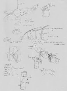
At the time of writing I am on the second day of the Final Major Project. Yesterday I was just sketching my ideas down, designing small elements of the scene I want to make and thinking about the floor plan but today I have been testing the scale of the structure to see if feels right spacially in engine, using various provided props as a guide. I know what shapes I want to use for the building but using the space these shapes produce effectively is quite complicated. I have run into the unsurprising problem of the cylindrical main room being too narrow.


This has led me to experiment with adding a balcony, as expanding the tube creates extra vertical space too. So far this is looking visually pleasing but it creates more problems in the positioning of stairs and deciding what to use this new room for. The headroom is quite low but I am hesitant to expand the area further for fear of ruining the exterior of the building.