Friday 30 January 2015

Week 3- Getting Stuck In

The week started with further feedback- I was given the idea of creating a cut-out area of wall where the screen was and relocating the mobile there from the corner of the room. The problem was that this would take a chunk out of one of the supporting struts. I decided to allow this for now with the hopes that with the other struts on either side it wouldn’t be a noticeable problem but I may return to it later if surrounding furnishings don’t help.

I decided the newly vacated space in the corner would be perfect for one of those futuristic hanging chairs, however since there is a window above it there is nothing to hang it from I will need to find a way of suspending it from the beams either side. The shapes I have used in the whitebox for it also aren’t necessarily what it will look like modelled- I am very conscious of the potential for it to end up looking retro instead of futuristic like intended.


Once all this rearranging was done I decided I was very happy with how things were looking so far and pushed ahead with the architectural modelling. I also started making the tileable textures to use on it. I had a clear vision of the kind of bricks I would use for the outside of the tube, but I didn’t have anything close from the photos I had taken in the past so I had to draw the bricks in from scratch. This also turned into an opportunity to experiment with creating tileable normal maps in Zbrush, something I had never done before. Currently I’d say it’s not entirely what I envisioned but I’m still quite proud, so I’m satisfied for now but I may revisit it later. I do still need to create a roughness map for it however.


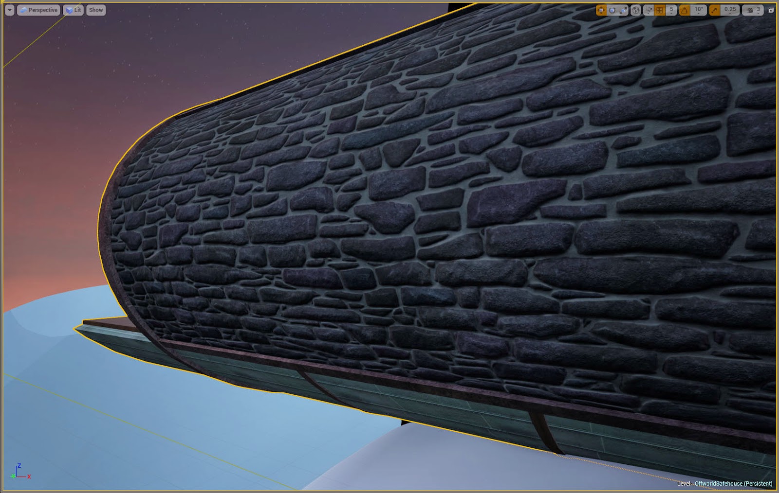
So far maintaining texture density has been quite a concern. My main issue with the bricks is that they aren’t the right scale, but while my original file is large enough to allow for adjustments, it would be difficult to keep it tiling properly due to the irregularity of the bricks. I am aiming for a texture density of roughly 512x512 per square meter, and with objects using multiple textures of different sizes I’ve realised it’s easier to scale textures in the material editor rather than changing the size of UVs.

Next week will most likely consist of continuing to tweak the building and making textures. The next step will be to incorporate it into the landscape and create foliage.

Friday 23 January 2015

Week 2 Summary

I began the week planning the layout of the kitchenette.
Received some critique from one of the tutors, and as a result I adjusted the bedroom to be shorter and wide enough to fit bedside tables and I extended the balcony out further. There were also concerns about space in the main room, but as I have been working on rectifying that already I wasn't sure how much I could do without causing more problems. I left this issue to worry about later in the week.
I blocked out a couple more assets to try and work around the scale issues, and I replaced the blocks currently being used for ground with actual terrain to work with later.
At one point I was having some issues with UE4’s automatic exposure being temperamental with glowing objects. Things looked fine in the editor window but change when run as a game. I managed to fix this by the end of the week with the help of one of the tutors by changing the bloom settings.
I also began sketching out props to act as clutter.


I added the steps and landing pad to the whitebox, and did a couple of sketches of the landing pad. I also sketched a couple of concepts for the generator.

At this point I decided there were parts of the whitebox I didn’t like- adjusted the landing pad to be lower and directly below the house’s main window. I also tried to make the room slightly wider in accordance to the feedback I had received earlier in the week, but I thought it looked strange when it was expanded by a large amount so I only made it fractionally bigger.
I then began remaking parts of the house more cleanly to hopefully use in the final asset later.

At the end of the week I received some more feedback. The main points of which were that the exterior portion of the scene could be laid out in a more interesting way and that the main room was still too small. I shifted the landing pad to be off centre, so that you can see the satellite dish from where you’d start.

Rescaling the main room took a while but eventually I managed to get the scale to be similar to that of the images I was inspired by such as the Deus Ex concept art. The result of these changes was of course having to adjust what I'd started properly modelling already but the improvement was worth it.


Friday 16 January 2015

The Rest of Week One

I was advised to find one or two key images to keep going back to so the project would stay on track. I chose these two pictures below from pinterest, as I felt they roughly captured the key elements of what I'm aiming for.


Progress for the rest of the week-

Wednesday

It took a while but I eventually concluded on the best possible place for the stairs up to the balcony. Even so, I was still not happy with it so I went back to the original floorplan, this time stretching the cylinder to the sides rather than trying to keep it a perfect cylinder.
The problem with the balcony was that it detracted from the lower floor, which was supposed to be the main attraction of the piece. I liked the look of it from downstairs, but making it accessible was a problem. This eventually led me to the idea of having a balcony-like area solely used for storage space, with a ladder up to it similar to those in a traditional library.


Thursday

I added some key props to the 3DS Max version of the whitebox so I would have their scale right for later. Then I started doing a paintover of the main room. I didn’t get very far since I didn’t have enough inspiration.

Friday


Went back to my pinterest board to find more inspiration for fleshing out the interior. I was advised by more than one person to look at the house in the film “Oblivion” but this was too clean and sterile looking for what I envisioned, though the suspended landing pad did catch my eye. I decided what I was going for was closer to the more cluttered look of the Deus Ex: Human Revolution concept art, just without the heavy atmosphere. My current problem is that I don’t know what to clutter the room up with. With this in mind I am going to leave this paintover here and do more rough sketches of things to include.

Interior paintover with only base props
A rough paintover of the surroundings and landing pad

Tuesday 13 January 2015

Start

For my FMP I want to demonstrate my ability to model a wide variety of different assets, and create a scene that captures the imagination of the player while staying on a manageable scale. I intend to create an isolated house on a possibly alien planet, and use different props to bring into question exactly what planet it is on.


At the time of writing I am on the second day of the Final Major Project. Yesterday I was just sketching my ideas down, designing small elements of the scene I want to make and thinking about the floor plan but today I have been testing the scale of the structure to see if feels right spacially in engine, using various provided props as a guide. I know what shapes I want to use for the building but using the space these shapes produce effectively is quite complicated. I have run into the unsurprising problem of the cylindrical main room being too narrow.


This has led me to experiment with adding a balcony, as expanding the tube creates extra vertical space too. So far this is looking visually pleasing but it creates more problems in the positioning of stairs and deciding what to use this new room for. The headroom is quite low but I am hesitant to expand the area further for fear of ruining the exterior of the building.